A salon website needs seven things to actually convert visitors into paying clients: a booking button visible on every page, a service menu with real prices, authentic photos of your work and space, easy-to-find contact info with a map, visible reviews, a mobile-first design that loads fast, and basic local SEO so people can find you in the first place. If your site is broken or you’re starting from scratch, fix these three first: the booking button, the priced service menu, and mobile load speed. Everything else matters, but those three decide whether someone books today or closes the tab.
Roughly 82% of salon bookings happen on mobile devices, and a large share of all web traffic overall now comes from phones rather than desktops, per Statista. A slow, desktop-built site isn’t losing you a few clicks. It’s losing you clients who never made it past the loading spinner.
- Visible booking button + real online booking (not just a phone number)
- Service menu with transparent, specific pricing
- Real photos of your team, chairs, and finished work
- Contact info, hours, and an embedded map
- Reviews and social proof near every decision point
- Mobile-first speed (aim for fast load times)
- Basic local SEO so Google actually surfaces you
Table of Contents
- What Are the Must-Have Elements on a Salon Website?
- Why Do Authentic Photos Matter More Than Stock Images?
- What Booking Features Does a Salon Website Need?
- How Should You Structure Service Menus and Pricing?
- How Do You Make Your Salon Findable on Google?
- What Content Builds Trust Before Someone Books?
- What Technical Standards Should a Salon Site Meet?
- How Does Your Website Connect to the Rest of Your Business?
- What Do Salon Websites Typically Cost and How Long Do They Take?
- What Website Mistakes Cost Salons the Most Bookings?
- What Should You Do This Week to Get More Bookings?
- An Editorial Take on Why Most Salon Sites Underperform
- Sources
What Are the Must-Have Elements on a Salon Website?
Think of your site as eight rooms, and every room needs a job. A homepage that doesn’t say what you do and where you are wastes the first five seconds you get with a stranger. A services page without prices sends people to a competitor who listed theirs. Here’s what each page needs at minimum.
- Home — Your name, location, specialty, and a booking CTA above the fold. No stock photo hero. Use a real shot of your space or a finished style.
- Services — Every service with a name, short description, duration, and price or starting price. Group by category (hair, nails, skin) if you offer more than eight or ten services.
- Booking — A dedicated booking flow or embedded widget, reachable in two clicks from anywhere on the site.
- About — Your story, your training, and a photo of you. Clients book people, not logos.
- Contact — Address, phone (click-to-call on mobile), hours, and an embedded map.
- Gallery — Real before-and-after shots, labeled by service.
- Reviews — Pulled from Google, displayed prominently, not buried on a separate page nobody clicks.
- Policies — Cancellation window, deposit rules, and any health protocols, written in plain language.
Microcopy matters more than owners think. A hero CTA that says “Book Now” converts fine, but “Check Availability” or “Book Your Appointment” tends to feel less like a hard sell and more like an invitation. On service blurbs, skip the adjectives and lead with the outcome: “Balayage that grows out soft, no harsh line” beats “Luxurious balayage services.”
Here’s how to prioritize the work if you’re staring at a half-finished or outdated site:
- This week: Add or fix the booking CTA, update prices, swap in three or four real photos.
- Next 2 to 4 weeks: Rebuild the services page structure, add a reviews section, embed your map, write proper policies.
- 4+ weeks out: Full redesign, professional photography, custom booking integration, multi-page content strategy.
Pro Tip: Screenshot your homepage on your phone right now. If you have to scroll past a big header image before you see any way to book, that’s costing you clients today, not eventually.
Why Do Authentic Photos Matter More Than Stock Images?
Stock photography is the fastest way to make a personal, hands-on business look generic. Clients aren’t hiring a brand template. They’re hiring you, your chair, and the specific way you cut a fringe or shape a brow. Real photography of your team and actual client work is one of the strongest trust signals a site can carry, according to salon web design specialists at Podium Design, and it’s the one thing a template can’t fake.
If you’re planning a photo shoot (even a phone-based one), aim for this shot list:
- One hero shot: you or your team, mid-work, natural light, no posed smiling-at-camera stiffness.
- Two or three workstation shots showing your actual space, tools, and product displays.
- Six to ten before-and-after pairs, shot from the same angle and distance for consistency.
- A few candid shots of consultations or client interactions if you can get a signed release.
Once you have the images, don’t just upload them at full size and hope for the best. A few rules keep quality high without tanking your load time:
- Export as WebP or compressed JPEG, not PNG, for photos.
- Resize to the actual display width. A 4,000-pixel-wide image displayed at 800 pixels is wasted bandwidth.
- Turn on lazy loading so images below the fold don’t block the initial page render.
- Write real alt text (“balayage on medium-length brown hair” not “IMG_4821”) for accessibility and image search.
Curated collections of effective salon sites consistently show clean, photo-forward layouts with generous whitespace, according to SiteBuilderReport, which is worth studying if you’re stuck on layout direction.
Pro Tip: Write staff bios and gallery captions like you’re texting a friend about the result, not writing ad copy. “Took her from box-dyed black to a soft caramel in one session” tells a better story than “Expert color correction services.”
The salons that convert best on their site aren’t the ones with the biggest budget for photography. They’re the ones who show the actual chair a client will sit in and the actual hands that will do the work.
What Booking Features Does a Salon Website Need?
The rule is simple: booking should be reachable in two taps or clicks from any page on your site, and on mobile, the CTA should stay visible as the user scrolls, according to Podium Design. A booking link buried in a footer or a “Contact Us” submenu is functionally invisible to most visitors.
Beyond placement, the booking experience itself needs a specific feature set to actually reduce back-and-forth:
- Real-time availability, not a form that requires you to call back and confirm.
- Staff or service-provider selection if you have more than one person on the schedule.
- Add-on options (deep conditioning, extra length, brow tint) at the point of booking.
- Automatic confirmation and reminder emails or texts.
- Payment pre-authorization or deposit collection for high-demand or high-cost services.
How you implement booking depends heavily on how big your operation is. Here’s how the three common approaches stack up:
| Approach | How it works | Best for | Trade-off |
|---|---|---|---|
| Embedded widget | Booking calendar loads inside your own site pages | Solo owners and small teams wanting quick setup | Easiest to launch, but design flexibility is limited by the widget provider |
| Hosted booking page (redirect) | Visitor clicks “Book” and leaves your domain for a third-party page | Owners prioritizing speed of setup over branding | Fast to implement, but you lose on-site engagement data and some SEO value |
| Native or API-based booking | Booking is built directly into your site using the platform’s API | Multi-stylist salons wanting full brand control | Best long-term control and data ownership, but requires more setup time or developer help |
Keeping bookings on your own domain rather than routing to a third-party page matters more than most owners realize. Sending clients off-site for booking preserves that provider’s SEO equity, not yours, and hands them a chunk of your traffic data, according to Fully Booked AI.
No-shows are the other half of the booking equation. Three moves cut them down fast:
- Require a card on file or a small deposit for first-time bookings.
- Send automated reminders 24 hours and two hours before the appointment.
- Sync your booking system with your actual calendar so double-bookings and gaps get caught automatically, not discovered at the front desk.
How Should You Structure Service Menus and Pricing?
The service menu is often the second most visited page on a salon site after the homepage, and vague or missing pricing is one of the fastest ways to lose a booking before it starts, according to Fernside Studio. If someone has to call to ask “how much for highlights,” you’ve already lost some of them to a competitor who just answered the question on their site.
Structure each service entry the same way, every time:
- Service name — Clear, not clever. “Balayage” not “Sun-Kissed Dimension Experience.”
- Short description — One or two sentences on what’s included and who it’s for.
- Duration — So clients can plan their day around it.
- Price or starting price — Use “starting at” for services with variable pricing based on hair length or condition.
- Add-ons — Listed separately so the base price stays clear.
- Book button — Right next to the listing, not just at the top of the page.
If your pricing genuinely varies by client (long hair color, extensive nail art), tiered pricing communicates range without forcing a phone call:
- Short hair / simple service: starting price
- Medium length / moderate complexity: starting price
- Long hair / full transformation: “consultation required, starting at $X”
Every service page (or the booking flow itself) should carry a few policy lines that head off the awkward conversations at checkout:
- Cancellation window (e.g., “24-hour notice required to avoid a cancellation fee”).
- Deposit requirements for new clients or high-cost services.
- Consultation or patch-test requirements for chemical services, stated plainly and in advance.
Pro Tip: Put your cancellation policy right on the booking confirmation screen, not just buried in a separate policies page. Clients read what’s in front of them at the moment they’re committing, not what’s three clicks away.
How Do You Make Your Salon Findable on Google?
A gorgeous website nobody can find is a beautiful waste of money. Local search is where most salon discovery happens, and it runs on a handful of unglamorous but non-negotiable details.
Your contact section needs, at minimum:
- Full street address (not just a neighborhood or “downtown”)
- Business hours, including any seasonal or holiday variations
- A phone number formatted as click-to-call on mobile
- Parking or public transit notes if your location is tricky to find
- An embedded Google Map, not just a text address
Beyond the contact page itself, a short local SEO checklist keeps you visible in search:
- Keep your business Name, Address, and Phone number (NAP) identical across your website, Google Business Profile, and any directory listings.
- Write page titles and meta descriptions that include your city or neighborhood, not just your service names.
- Set up and fully complete your Google Business Profile, including categories, hours, and photos.
- Add LocalBusiness schema markup to your site’s code so search engines can parse your business type, hours, and location directly.
That last point sounds technical, but it’s a small addition with outsized payoff. Adding structured data for your business type, opening hours, and geographic coordinates helps search engines understand exactly what you are and where, which can improve how you show up in local map results and voice search. If you’re not comfortable editing code, most website builders and a lot of freelance developers can add this in under an hour.
How long does it take Google to index a new salon website? Typically one to four weeks for initial indexing, though ranking well for competitive local terms can take a few months of consistent content and reviews.
Do I need a blog for local SEO? Not strictly, but a few location-specific pages or posts (like “best hair colors for [your city]'s climate”) give search engines more relevant text to match against local searches.
Mobile traffic dominance makes this doubly important: a large share of local searches happen from a phone while someone is already out and deciding where to go next, per Statista’s mobile traffic data. If your map doesn’t load fast or your address is buried, you lose that walk-in moment entirely.
What Content Builds Trust Before Someone Books?
Trust signals need to sit exactly where hesitation happens, not off in a corner. Put a review snippet in your hero section. Put a testimonial near the “book now” button on your services page. Put your Instagram feed in the footer where people scroll right before they leave. Scattering social proof randomly wastes it; placing it at decision points doubles its value.
A few small FAQ additions on service pages solve most of the questions that otherwise generate a phone call:
- “How long will this take?”
- “What should I do to prepare?”
- “Can I bring a color reference photo?”
- “What’s your cancellation policy?”
Before-and-after galleries convert best when they follow a consistent format: same angle, same lighting setup where possible, and a caption naming the service and the stylist who did the work. “Balayage by Jamie, 3 hours, color-safe formula” tells a much richer story than an unlabeled photo grid, and it gives credit that makes staff want to keep contributing new work. Portfolio-focused sites tend to organize these galleries by service category rather than dumping every photo into one feed, according to SiteBuilderReport’s inspiration gallery.
Run through this checklist for your trust layer:
- Google reviews displayed on-site, not just linked externally.
- Two or three short client testimonials with first names and specific results.
- Instagram feed embedded and updated regularly.
- A dedicated bridal or event page if that’s a meaningful part of your business, with its own mini portfolio.
A five-star badge means nothing if it’s sitting in isolation. Context, the specific service, the specific stylist, the specific result, is what turns a stranger’s skepticism into a booking.
What Technical Standards Should a Salon Site Meet?
Speed and mobile usability aren’t nice extras. They’re the foundation everything else sits on, and given that a large majority of bookings happen on mobile, per Fernside Studio, a site that’s slow or clumsy on a phone is failing at its primary job.
Set a real performance target: aim for under two seconds of load time on mobile. Test it with Google PageSpeed Insights or the Lighthouse tool built into Chrome DevTools, both free, and both blunt about exactly what’s slowing you down.
Mobile-first design means a few specific things in practice:
- Tap targets (buttons, links) sized large enough to hit accurately with a thumb.
- Your booking CTA visible without scrolling, ideally as a fixed header or floating button.
- Forms kept short. Every extra field is a chance for someone to abandon the booking.
- A simplified, single-column booking flow rather than a desktop layout squeezed onto a small screen.
Accessibility basics are often skipped, but they widen who can actually use your site and they overlap heavily with good SEO practice:
- Alt text on every meaningful image.
- Color contrast high enough that text is readable for people with low vision.
- Full keyboard navigation for anyone who can’t use a mouse or touchscreen.
- Forms with clear labels, not just placeholder text that disappears when someone starts typing.
Security rounds out the list: your site needs SSL (that padlock icon and “https”), and any payment processing must run through a PCI-compliant provider rather than a homemade form. Your privacy policy should be linked in the footer of every page, not hidden three clicks deep. Performance-first builds without heavy template bloat can produce meaningfully faster load times and stronger Lighthouse scores than generic templates, according to Built2WinWeb, which matters both for search ranking and for keeping impatient mobile visitors from bouncing.
How Does Your Website Connect to the Rest of Your Business?
A salon website that just sits there displaying pretty photos is only doing half its job. The real value shows up when a booking on your site flows into your appointment system, that appointment data flows into your POS, and your POS numbers sync with something like QuickBooks so you can actually see what’s working.
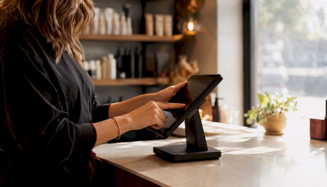
Picture the flow: a client books online, that booking populates your calendar and your POS automatically, the resulting sale and tip data sync to your bookkeeping, and a connected dashboard turns that raw activity into a picture of which services fill your book and which ones sit empty. Without that chain, you’re reading three sets of numbers by hand and guessing at the story between them.
This is also where domain ownership stops being an abstract point and starts costing or saving you real money. Sites that route every booking through a third-party page hand that provider the SEO equity and the traffic data instead of keeping it on your own domain, according to Fully Booked AI. Keep booking on-site, and every visit, every repeat client, and every referral link builds value you actually own.
A few practical things to check on your own setup:
- Does your booking tool export data to your POS automatically, or are you re-entering appointments by hand?
- Can you see, at a glance, which services generate the most revenue per hour of chair time?
- Do you know your no-show rate for the last 90 days without pulling three separate reports?
This is precisely the gap LumariPRO was built to close. It connects booking activity, POS data, and QuickBooks into one dashboard built specifically around suite rental and independent beauty business economics, not generic small-business templates that don’t understand service pricing or retail margins.
Pro Tip: Before you invest in a full site redesign, check whether your current booking tool can even export basic data. A beautiful new site connected to the same blind spot doesn’t solve anything.
Your website isn’t just a brochure. Once it’s connected to your booking and financial systems, it’s the one employee working 24 hours a day, and the only one whose performance you can actually measure in real numbers.
What Do Salon Websites Typically Cost and How Long Do They Take?
Timelines and budgets scale with how much you’re changing, not just how big your salon is. A single-page pricing update looks nothing like a full multi-location rebuild, and treating them the same way is how projects blow past both schedule and budget.
Rough timeline buckets:
- Quick fixes (updating prices, swapping photos, fixing a broken booking link): about a week.
- Full redesign or rebuild (new structure, new booking integration, professional photography): three to six weeks.
- Authority build or multi-location site (multiple locations, deeper content strategy, custom integrations): six to twelve weeks.
Cost follows a similar pattern depending on how you build it:
- DIY on a website builder: low upfront cost, mostly your own time, limited by template flexibility.
- Small agency or freelancer: mid-range cost, faster turnaround, custom design within a set scope.
- Custom build with a developer: highest upfront cost, but the most flexibility for booking integration and multi-location needs.
The biggest cost drivers, regardless of who builds it, are custom design work, the number and complexity of integrations (booking, payments, POS), and total page count. A ten-page site with a native booking API costs meaningfully more than a five-page site using an embedded widget.
| Project type | Typical timeline | Main cost drivers |
|---|---|---|
| Simple update | About 1 week | Content changes, photo swaps, minor copy fixes |
| Full redesign | 3 to 6 weeks | New structure, booking integration, professional photography |
| Multi-location site | 6 to 12 weeks | Multiple locations, custom integrations, deeper content build |
Beyond the build itself, budget for ongoing costs that don’t disappear once the site launches: hosting, your booking platform’s monthly or per-booking fees, occasional maintenance, and some modest monthly spend on local marketing or ads if you want to accelerate growth beyond organic search. Square’s practical build guidance covers the sequence well: register a domain, pick a builder, build core pages, apply SEO practices, promote, and track results, a useful checklist whether you’re doing this yourself or briefing someone else.
What Website Mistakes Cost Salons the Most Bookings?
Most broken salon sites aren’t broken in some dramatic technical sense. They’re broken in small, fixable ways that quietly bleed bookings every single day.
The repeat offenders:
- Hidden booking CTA — buried in a menu or only available on one page.
- Stock photography — generic salon images that could belong to any business in any city.
- Missing prices — forcing a phone call for information that should be one click away.
- Slow-loading pages — especially heavy, uncompressed hero images.
- No embedded map — just a text address nobody wants to manually search.
- Broken booking links — a “Book Now” button pointing to a dead page or an outdated third-party tool.
Here’s the fastest path to fixing the damage, roughly in order of impact:
- Test your own booking button on your phone, right now, and fix it if it’s broken or hard to find.
- Add starting prices to every service listing, even if they’re ranges.
- Swap your worst three stock or blurry photos for real phone shots of your space or work.
- Run your homepage through PageSpeed Insights and compress any image scoring red.
- Embed a Google Map on your contact page if you don’t already have one.
- Read your cancellation policy out loud. If it’s confusing to you, it’s confusing to clients.
- Check that your Google Business Profile hours match your actual website hours.
A few before-and-after pairings show how small the fix often is against how big the problem feels:
- Problem: Booking CTA only in the footer. Fix: Add a fixed header button and a floating mobile CTA.
- Problem: “Call for pricing.” Fix: List a starting price for every service, even a range.
- Problem: Six-second load time from an uncompressed hero photo. Fix: Compress and resize to actual display dimensions.
Pro Tip: Ask a friend who’s never been to your salon to try booking an appointment on your site while you watch silently. Where they hesitate is exactly where you’re losing real clients.
What Should You Do This Week to Get More Bookings?
The single most important thing this checklist proves: a salon website converts visitors into clients when booking is visible everywhere, pricing is transparent, photos are real, and the whole experience loads fast on a phone.
Start with the highest-impact actions, not the whole list at once:
- Add a persistent booking CTA to your header and, on mobile, a floating button.
- Publish a complete service menu with starting prices for everything you offer.
- Replace your weakest five or six images with real before-and-after shots or team photos.
- Embed a Google Map and double-check your address, hours, and phone number match everywhere they’re listed.
- Add a short FAQ section addressing the three questions you get asked most on the phone.
- Test your site’s mobile load speed and fix anything scoring in the red.
A simple seven-day plan, one task a day, gets most of this done without derailing your week:
- Day 1: Fix or add the booking CTA.
- Day 2: Update service pricing.
- Day 3: Swap in three to five real photos.
- Day 4: Embed your map and verify contact info.
- Day 5: Add or update your FAQ section.
- Day 6: Run a speed test and fix the biggest issue it flags.
- Day 7: Check your Google Business Profile matches your site exactly.
Once these changes are live, track one number: your booking conversion rate, meaning site visitors who actually complete a booking. Even a rough weekly count tells you whether the fixes are working before you sink more time or money into a bigger redesign.
| Point | Details |
|---|---|
| Fix booking access first | A visible, persistent booking CTA reachable in two clicks matters more than any design upgrade. |
| Price transparency reduces friction | Listing starting prices on every service stops phone-call bottlenecks and builds upfront trust. |
| Real photos outperform stock | Authentic shots of your team, chair, and finished work build trust that generic imagery can’t. |
| Mobile speed drives bookings | With most bookings happening on mobile, a slow site directly costs completed appointments. |
| Connect the site to your numbers | Syncing bookings, POS, and financial dashboards turns your website into a measurable business tool. |
An Editorial Take on Why Most Salon Sites Underperform
Most salon websites fail for a boring reason: they were built to look good in a portfolio review, not to survive contact with an actual mobile visitor standing outside a competitor’s storefront trying to decide where to book. The checklist in this guide isn’t clever. It’s the same seven things over and over, because those seven things are where almost every lost booking actually happens.
The part owners underestimate isn’t design. It’s the wiring behind the design. A gorgeous booking flow that dead-ends in a spreadsheet nobody checks is worse than a plain one connected to real data, because the plain one at least tells you the truth about what’s working. That’s the whole argument for treating your site as a business instrument, not just a brochure: it should feed your calendar, your POS, and eventually a dashboard that tells you whether your Tuesday afternoons are empty because of pricing, staffing, or a booking button nobody can find.
That’s the gap LumariPRO exists to close for suite renters and independent beauty professionals who don’t have a corporate IT team building that connective tissue for them. If your site’s next redesign doesn’t also plug into how you price, staff, and forecast, you’ve fixed the storefront and left the back office exactly as blind as before.
Sources
- Salon & Beauty Website Design | Web Design for Salons | Sussex & UK
- Salon and Spa Website Essentials for 2026 | Fernside Studio
- Statista — share of website traffic coming from mobile devices
- Salon Websites: 25+ Inspiring Examples (2026) — SiteBuilderReport
Recommended